
Overview
Datuum is a hybrid SaaS data management platform that simplifies data migration, merging, and analytical systems creation, resulting in an 80% reduction in data-related process time.
Building a completely new user experience from the founder’s the idea to a real product was an interesting challenge similar to navigating in a darkroom — we had to learn from our mistakes and practice a lot to get everything right.
Roles & Responsibilities
Aligning design decisions with the Product Owner’s vision, Stakeholder Meetings, Product Design Strategy
User Research, User Studies, User Testing, Wireframing UX Patterns
UI Design, Brand Identity Refinement for UI, Graphic Design for PR & Marketing items
Prototyping User Flows, Features, Components for validation & user testing
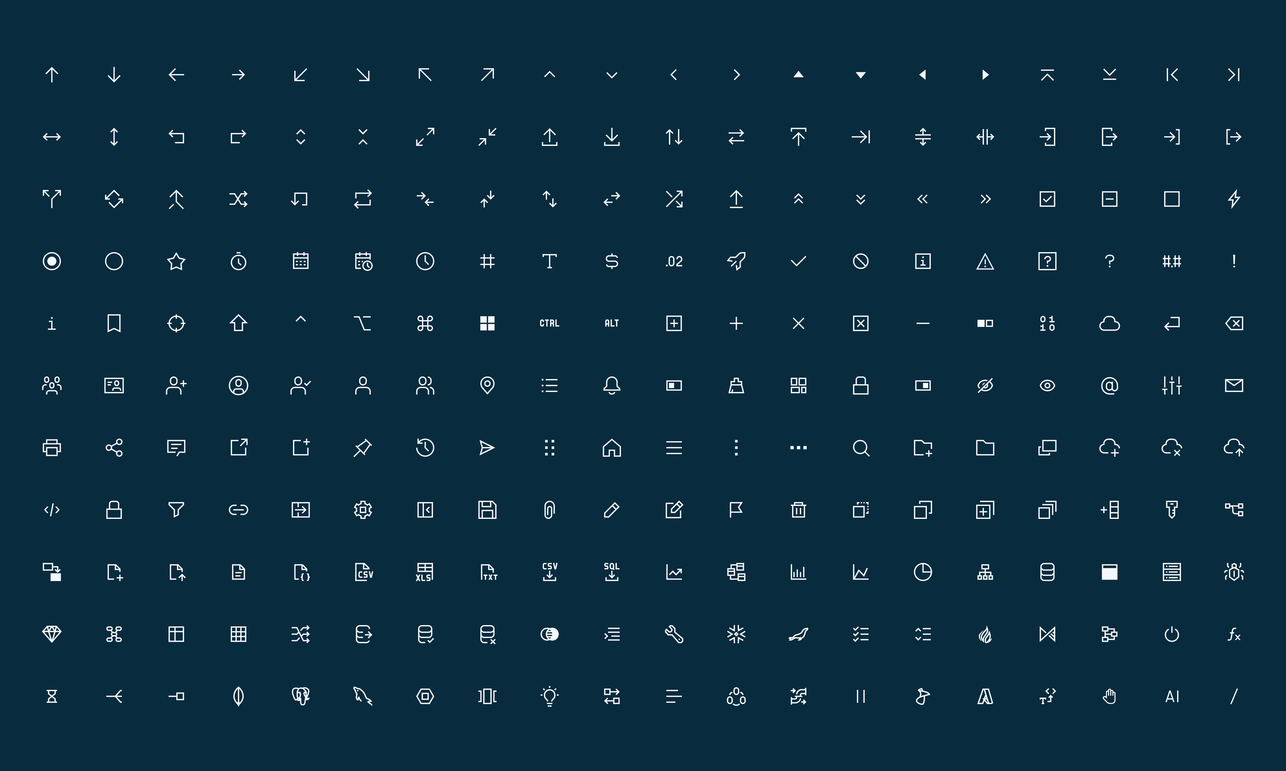
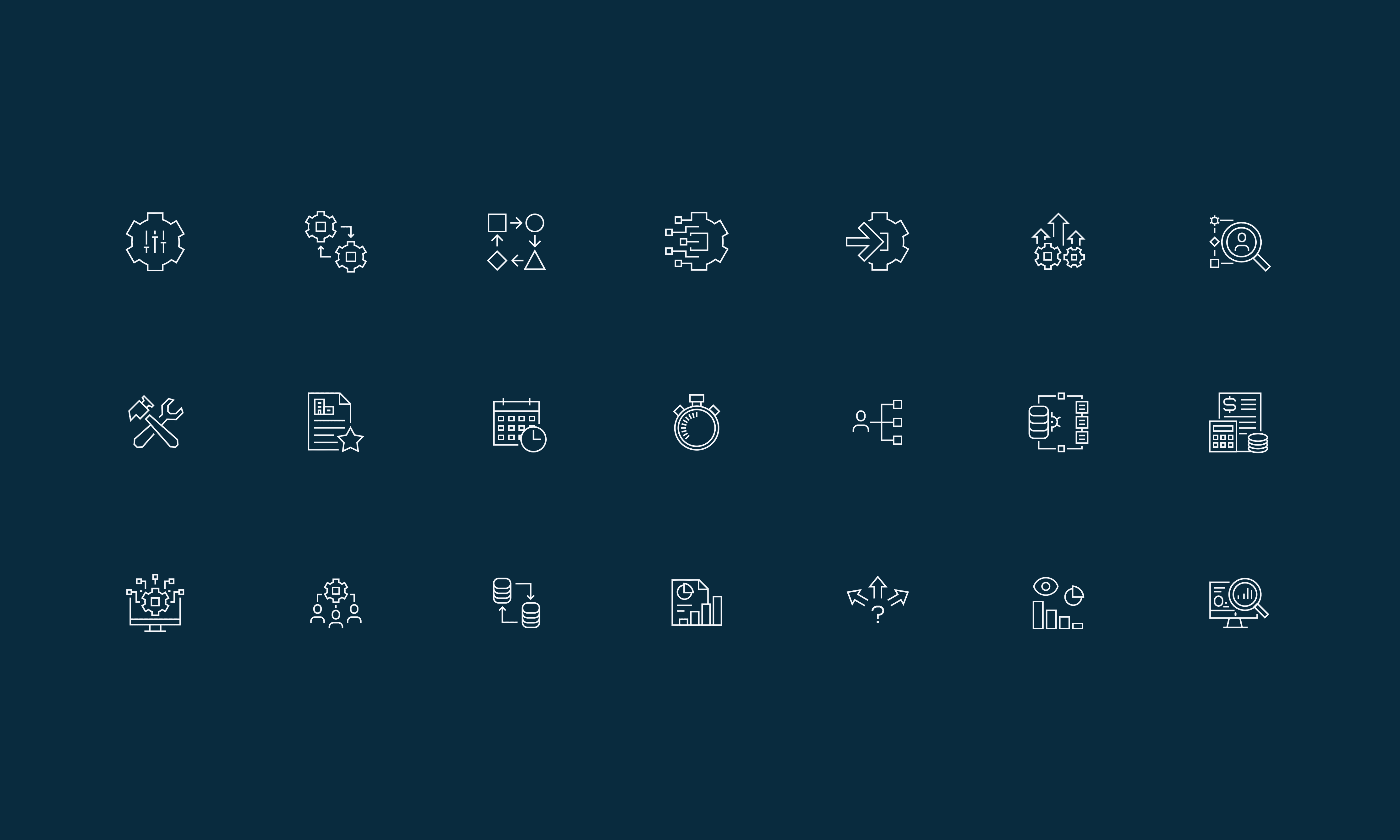
Creating the complete design system using Atomic Design principles. Redesign of the whole design system to accommodate the new Brand Identity.
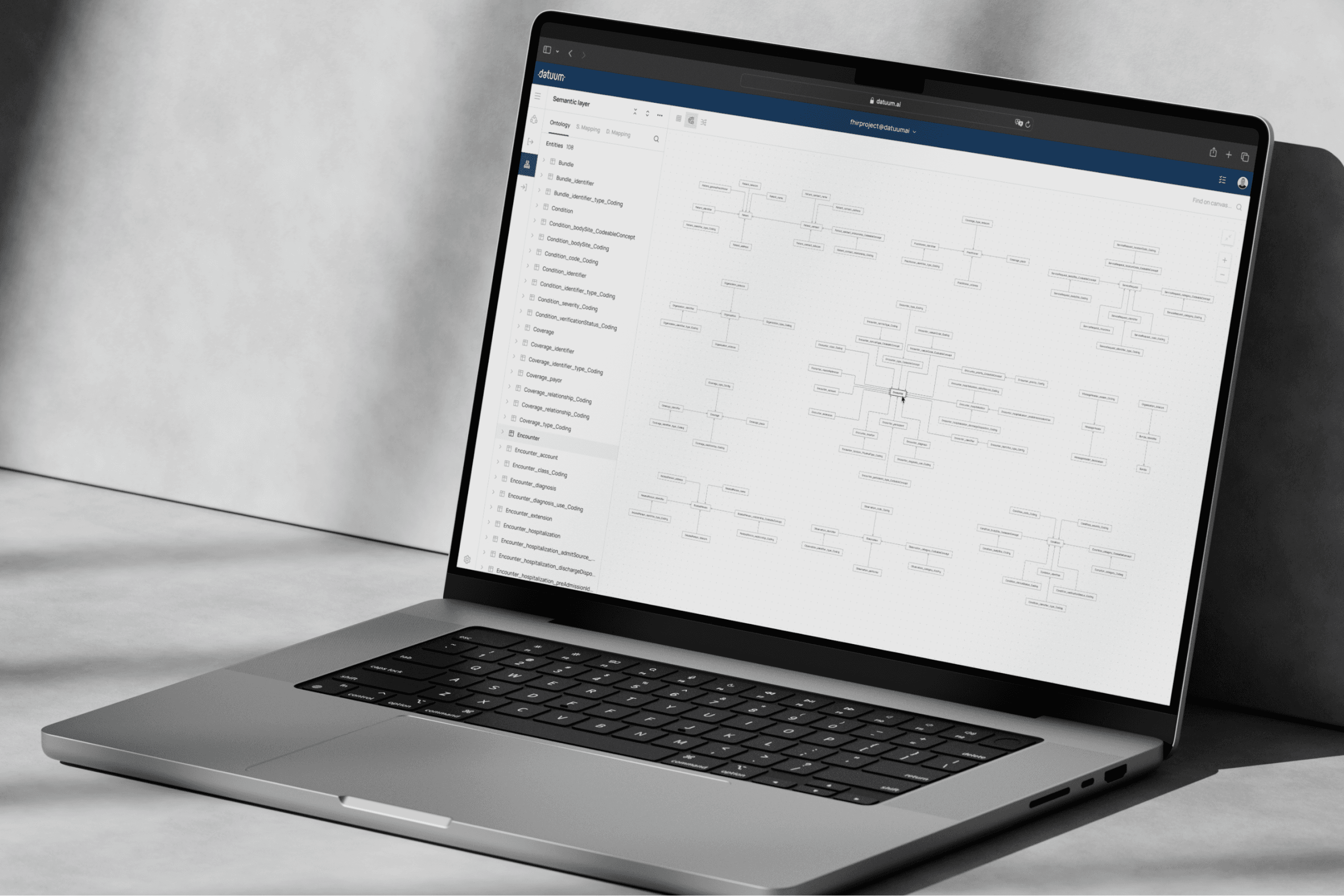
Platform
The emphasis was on making the UI that would be accessible both on small & large resolution Desktop screens.
The Kickoff
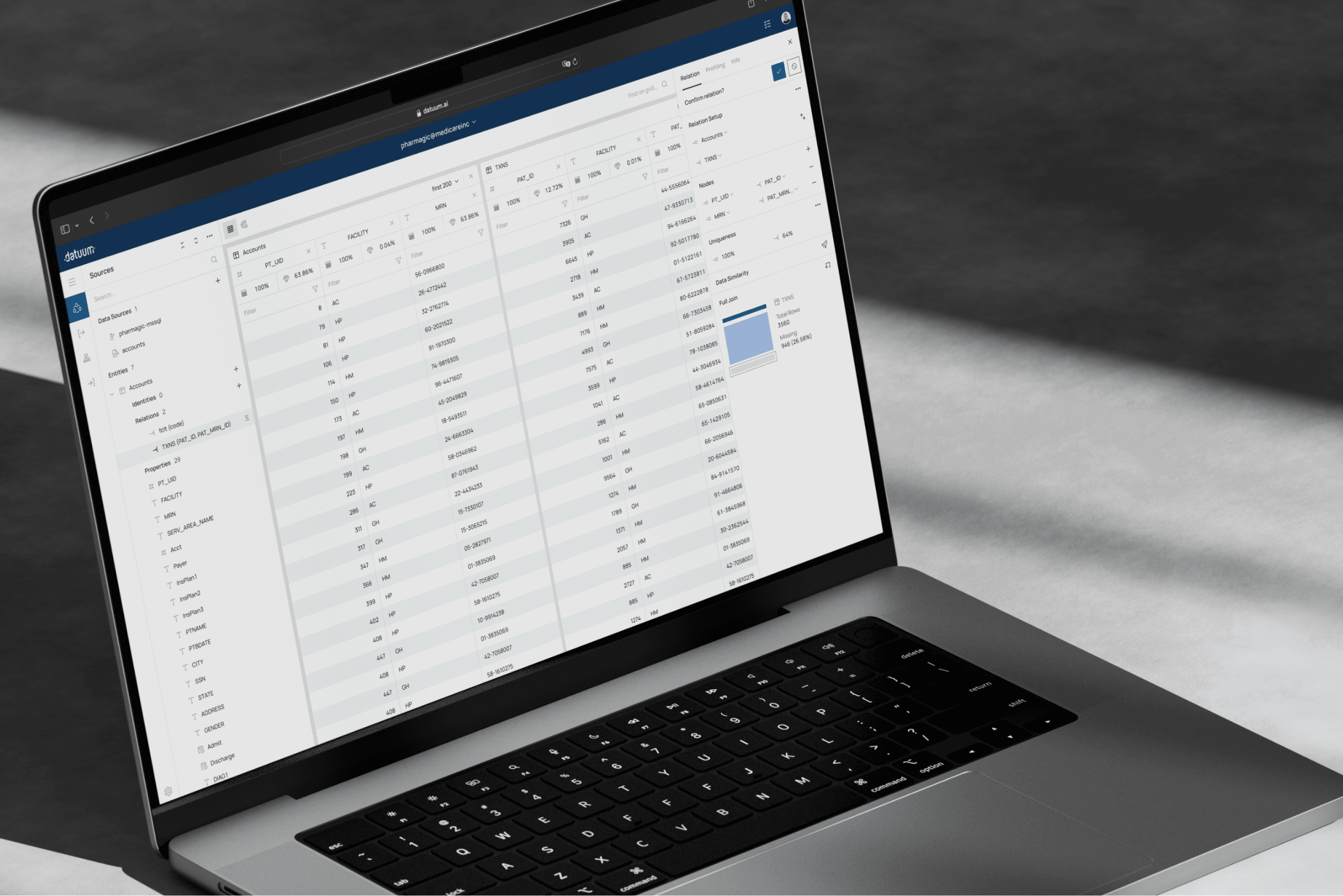
When I joined the team as a UI/UX designer there was already a working MVP version of the product and a brand identity used in the product landing page. During the first couple of months, I was asked to redesign some of the components to make them more user-friendly, align the design with the brand identity, and introduce some features. This UI allowed us to user-test all the new features and rectify the development process.
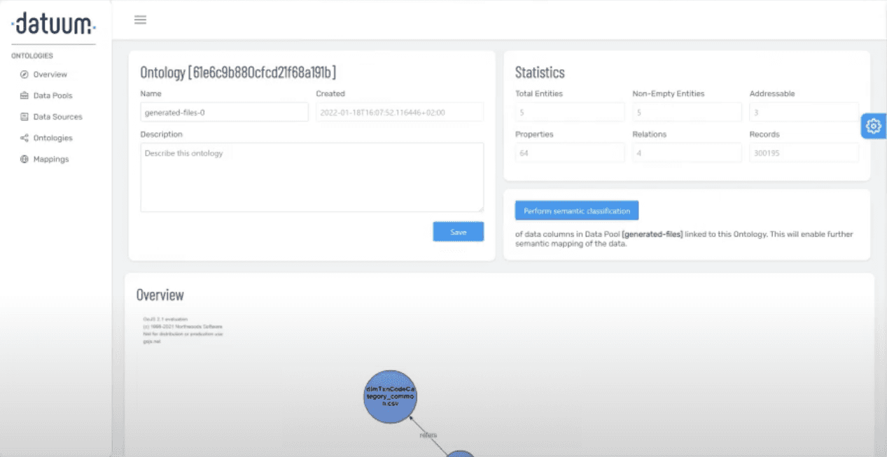
That's what Datuum looked like, when I joined the startup
However, as it happens in startups, things began to change fast. This is the moment the real challenges arose.
Problems
Tangled
Complicated
Infinite
Opportunity
Goals
Relevant
Intuitive
Definitive
Experience
Before diving into the specifics, I'd like to highlight that the true catalyst for our success were team sessions, demonstrating that regardless of the project's stage, it’s the combined effort of every team member that sustains momentum. This journey has transformed Datuum, reinforcing the power of teamwork in my mindset.
Picking the Right Moment — Information Architecture (IA)
When I began working on the pilot version of our product, my primary concern was the Information Architecture (IA). Even after my onboarding, the entire model still seemed overly complicated. I was unsure whether my confusion was due to a lack of my domain knowledge or if the model was inherently complex.
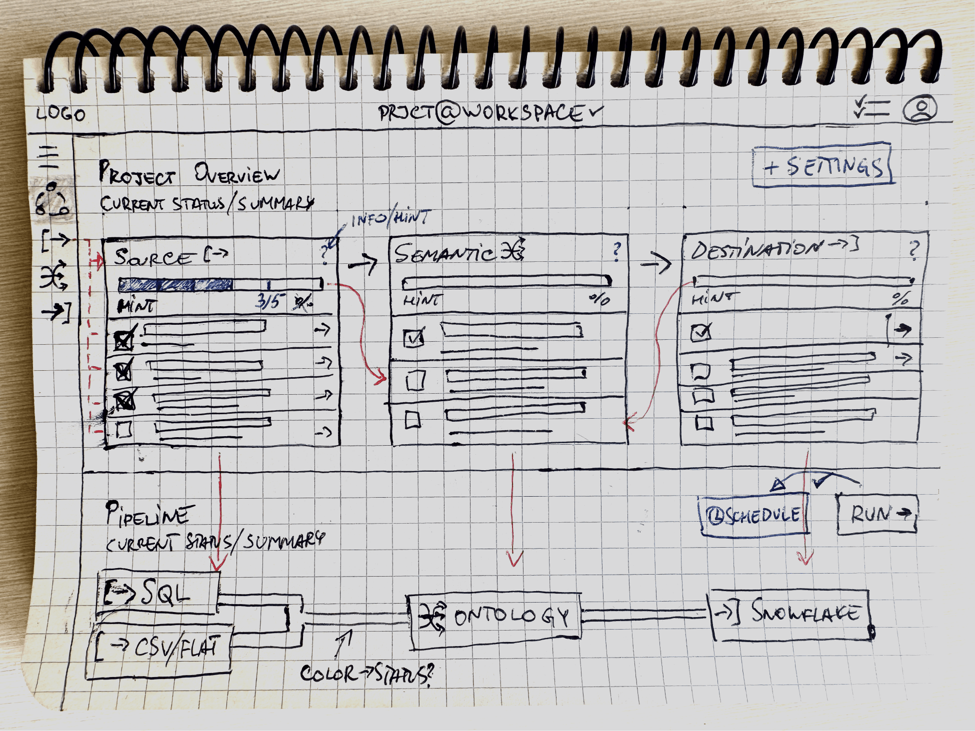
Here’s the initial version ( — ) and the subsequent versions 1 and 2 ( - - ):

The model mirrored the product's internal architecture, providing a robust platform for rolling out features at a fast pace. At the time, our primary focus was on adding mapping functionality, so I didn't take the liberty to articulate my problem with the IA.

As time went by, we introduced numerous features and conducted user testing with various datasets to understand how users might utilize them in different scenarios. I noticed that the platform was losing its usability, and the standard onboarding process for new participants began to take too much time.
The Turnaround
When the development team was ready to introduce a project-oriented architecture and product management initiated the brand redesign simultaneously, I felt it was an ideal opportunity to refine the information architecture (IA) and optimize user flows for each user persona.
To address this, I began by reviewing my notes from our client sessions, organizing them according to the various stages of the user flow. This allowed me to identify pain points and opportunities for enhancement specific to each persona. I then consulted with management to present my proposed changes, soliciting their feedback to ensure alignment with their vision for the product. This collaborative approach ensured that the design strategy was cohesive and well-informed, laying a solid foundation for future iterations.
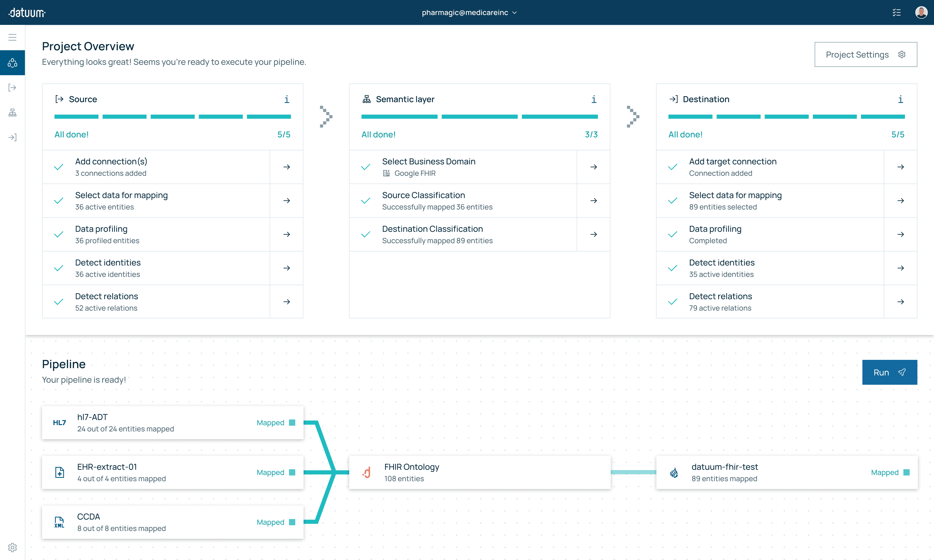
Below is the finalized IA I developed, designed to support the new product architecture and enhance the overall user experience.

At the higher workspace level, the structure is simple: teams and projects tabs allow multiple groups of members to be assigned to either common or separate projects — a significant feature for enterprise-level clients.
Adapting to the new architecture, I aimed to use the progressive disclosure technique for each user journey, making the entire process feel light and intuitive. Hence, the IA mainly follows a sequential pattern for pipeline components — source, target, and semantic layer, introduced in a new model. Better still, users can choose which component to configure first — a key feature retained from the previous version. Finally, making each project represent a single pipeline brought a lot of clarity and simplicity to users.
Design with Users — Dashboard
Since our pilot release, the Overview page was at the TBD stage for a significant period, with only a mockup I initially created for the first version of the design system. While revising the user journey map during the product architecture update, I realized that a comprehensive Project Overview page could significantly improve the user experience. This improvement could also address our ongoing challenge with user autonomy.
When discussing our global project vision, an image popped into my mind — a series of building blocks that are connected together to create a data pipeline. This structure, unlike traditional dashboards with static charts, would allow users to inspect and interact with the data flow from any angle. I imagined users seeing the entire journey of their data, from its source to its final destination, intuitively and dynamically.
The idea took shape through numerous sketches and brainstorming sessions. I thought about how users would need to catch up after a break to resume their task or sign in to adjust the pipeline schedule. This vision guided me to design an informative and engaging visualization, ensuring every piece of information was accessible at
a glance.
User needs are not user 'wants' — User Flows
If you've conducted user interviews, you know users can request anything. However, as a user experience designer, it's my job to uncover their true needs by addressing their feelings and motivations at each step of the user journey. I had an opportunity to test myself when optimizing the first part of the main user flow — the discovery stage.
At the start, the discovery stage involved a tedious process of connecting and analyzing source data. Some actions were sequential, while others were triggered by specific buttons when needed. With more people testing this, we noticed that even the simplest tasks seemed somewhat confusing or misleading. Although it was faster than manual tasks, the process was still quite lengthy.
To address this, I began by analyzing how and when users interacted with each step of the user flow. User sessions revealed that some users were confused by the terminology, while others found certain steps unnecessary. Additionally, users often struggled to estimate the time automatic tasks would take to complete.
I turned these notes into an affinity diagram and consulted our principal developer to understand what was happening at each stage in the background. I mapped out the entire discovery flow, including the actions performed with the extracted data that were invisible to the user. With this comprehensive view, it was time to optimize the process.
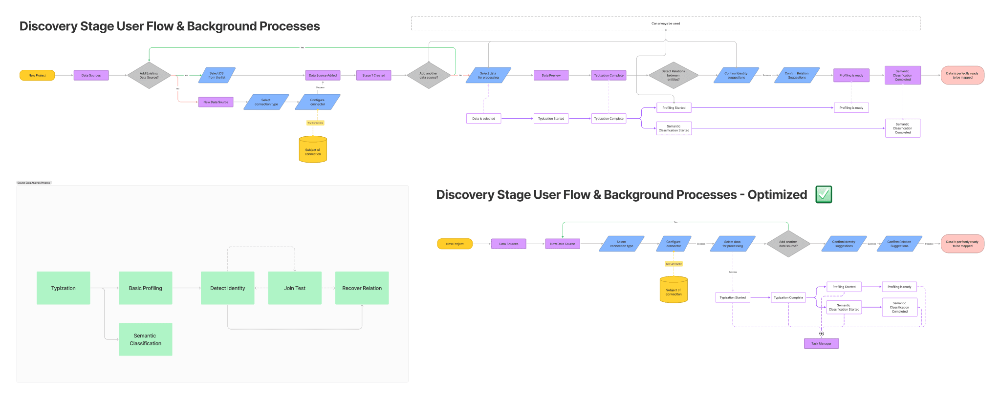
As you can see, the optimized version of the user flow is nearly half the length of the initial one without sacrificing functionality
Looking into the diagram, I realized that some user-initiated steps could be launched in the background without affecting the end result. Additionally, modular windows with progress bars and no ETA didn’t clearly show what was happening or how long it would take, so it made sense to replace them with something more elegant and useful.
The hypothesis was to remove everything that didn’t require user action from the main user flow. Only tasks where users needed to interact with the UI were kept, while all other tasks were performed in the background without modal windows blocking the interface. This made the flow more linear and simple to understand: "You've done this, let's do that now."
However, power users wanted to monitor background processes and take control on some occasions. To address this, we enhanced the existing task manager with composite tasks and additional UI controls, enabling advanced users to manage the workflow comprehensively without disrupting the streamlined experience for non-technical users.

A task manager accessed from the top bar is a neat and efficient way to keep users updated on background processes
This case demonstrates the effectiveness of the progressive disclosure principle. We simplified a complex flow into a clear sequence of steps while maintaining advanced functionality, which can be managed via a separate UI component.
Design System
I used two design systems for this project. The first was based on Google Material You, because it was a good platform with robust and reliable components for all the features we needed to implement quickly.
However, as we delved into development, we discovered that Material You's emphasis on cross-platform consistency posed challenges. While this uniformity is beneficial in some contexts, it limited our ability to utilize certain features to their full potential. Moreover, the design language of Material You didn't always mesh seamlessly with our custom components, necessitating several rounds of iteration to achieve a cohesive visual experience.
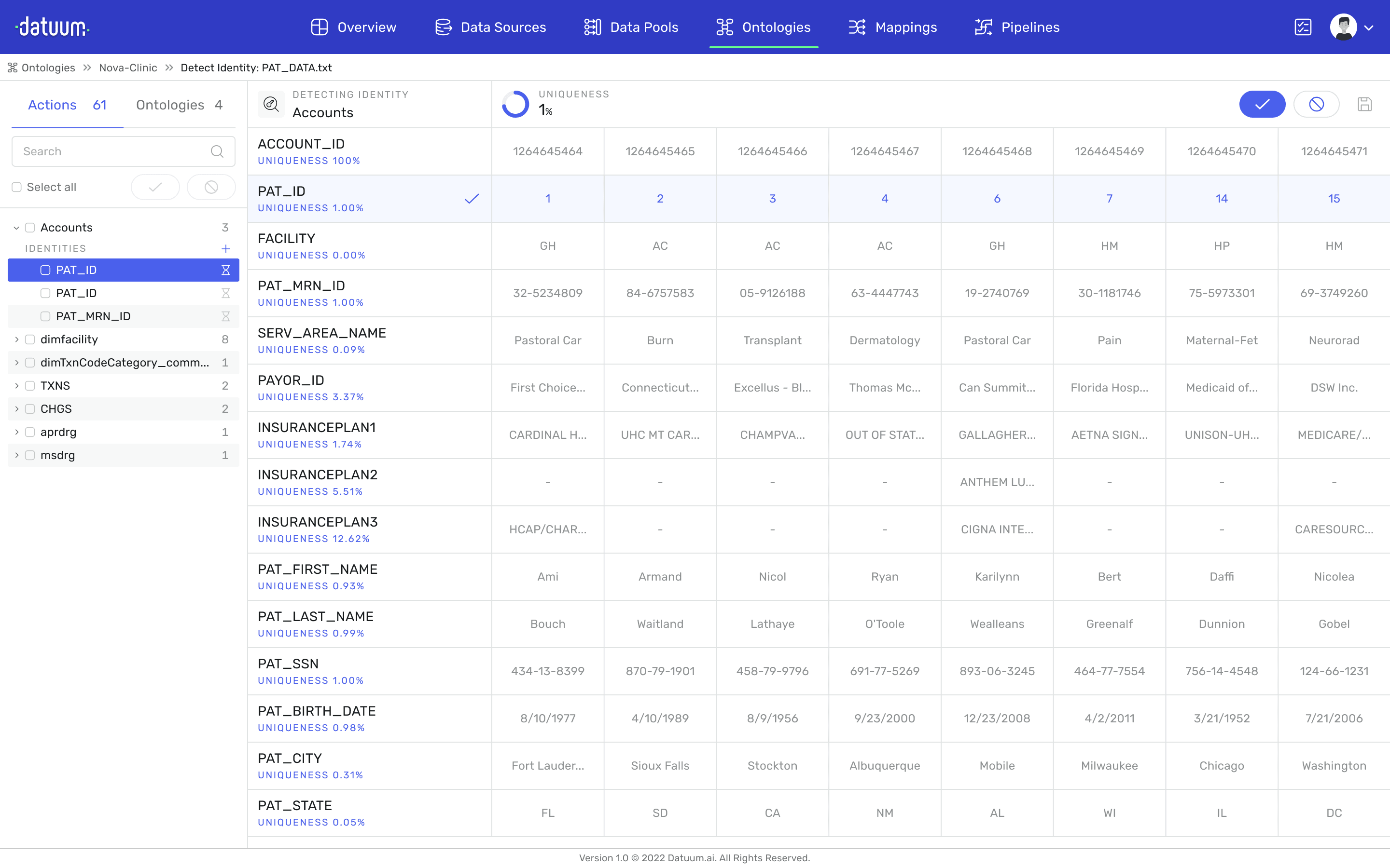
First iteration of the UI was hugely inspired by Material UI
The Redesign
To address these limitations and meet the requirements of our new product update – namely, an enterprise-level UX with minimalist yet practical components and reusable design patterns – I embarked on developing a second, custom design system.
Inspired by the sharp-cornered aesthetic of our new brand identity, I found the IBM Carbon Design System to be a good reference point. This iteration focused on resolving the previous system's shortcomings and establishing layouts that could accommodate future features. After a few rounds of refinement, I developed a set of modular components tailored to our specific needs.

User Testing Results
Time on Task
Task Success Rate
Finished Product
After more than 2 years of development, I'm proud to present the finalized design.

Press
Datuum: Automate Data Onboarding with AI
Here's a short video I made to showcase Datuum's new capabilities.
The AI-Driven Autopilot for Data Integration and Management
“datuum.ai’s hybrid SaaS data management platform marks a significant step forward in the world of data Integration and management.” - US Venture News