Education for life
Overview

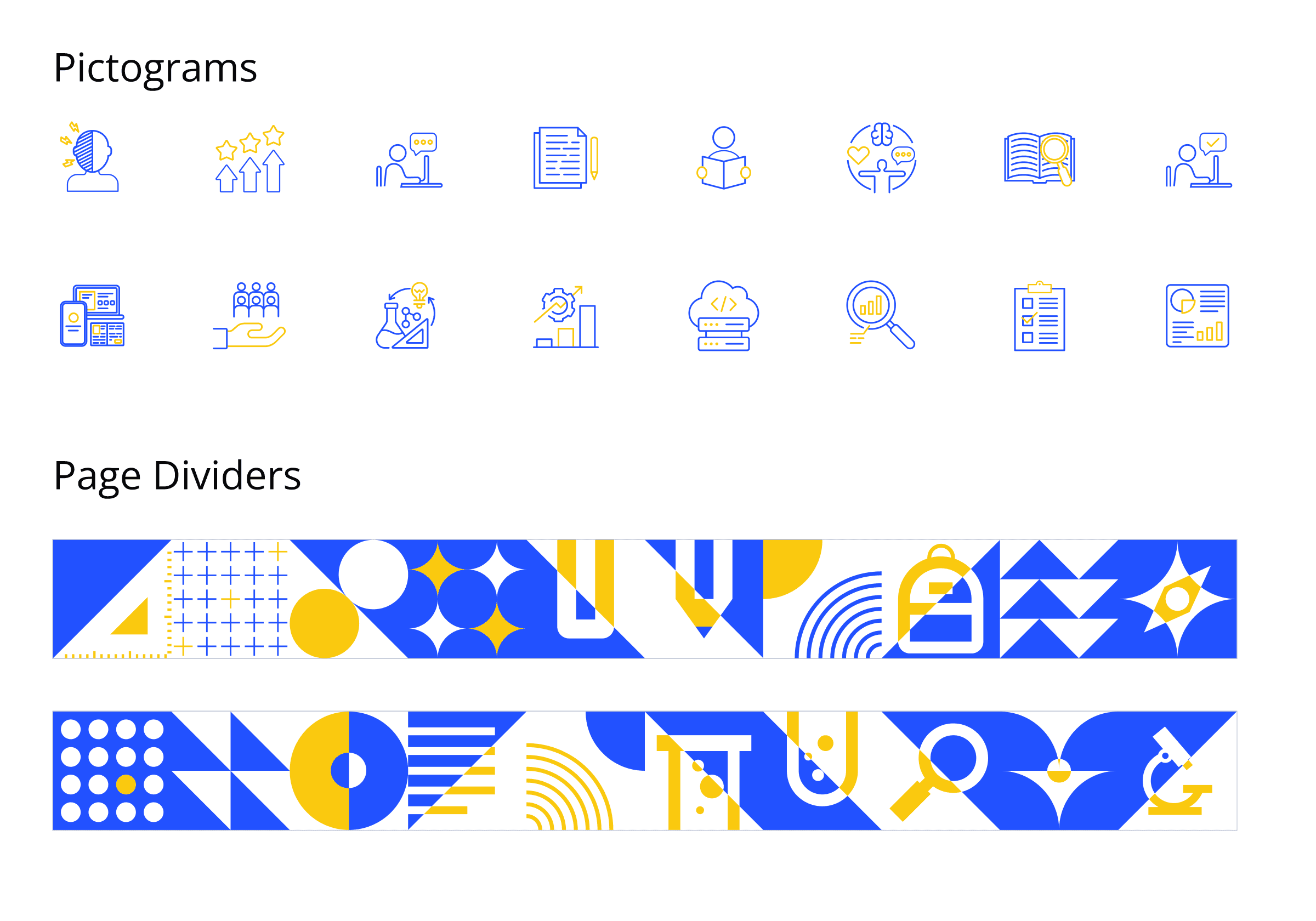
The website needed Ukrainian and English versions, incorporating numerous images, videos, and diagrams. Additionally, the organization lacked a cohesive brand identity, having only an outdated logo. This meant I also needed to develop a brand kit to establish a visual languagefor the website.
Fortunately, some content was still in development, granting me time to research and map out a comprehensive site structure. With a tight six-week deadline, I took on the development myself to ensure timely completion.
Roles & Responsibilities
Platform
Create a responsive website with interactive elements
The Kickoff

Social media can be used as a source of inspiration for visuals


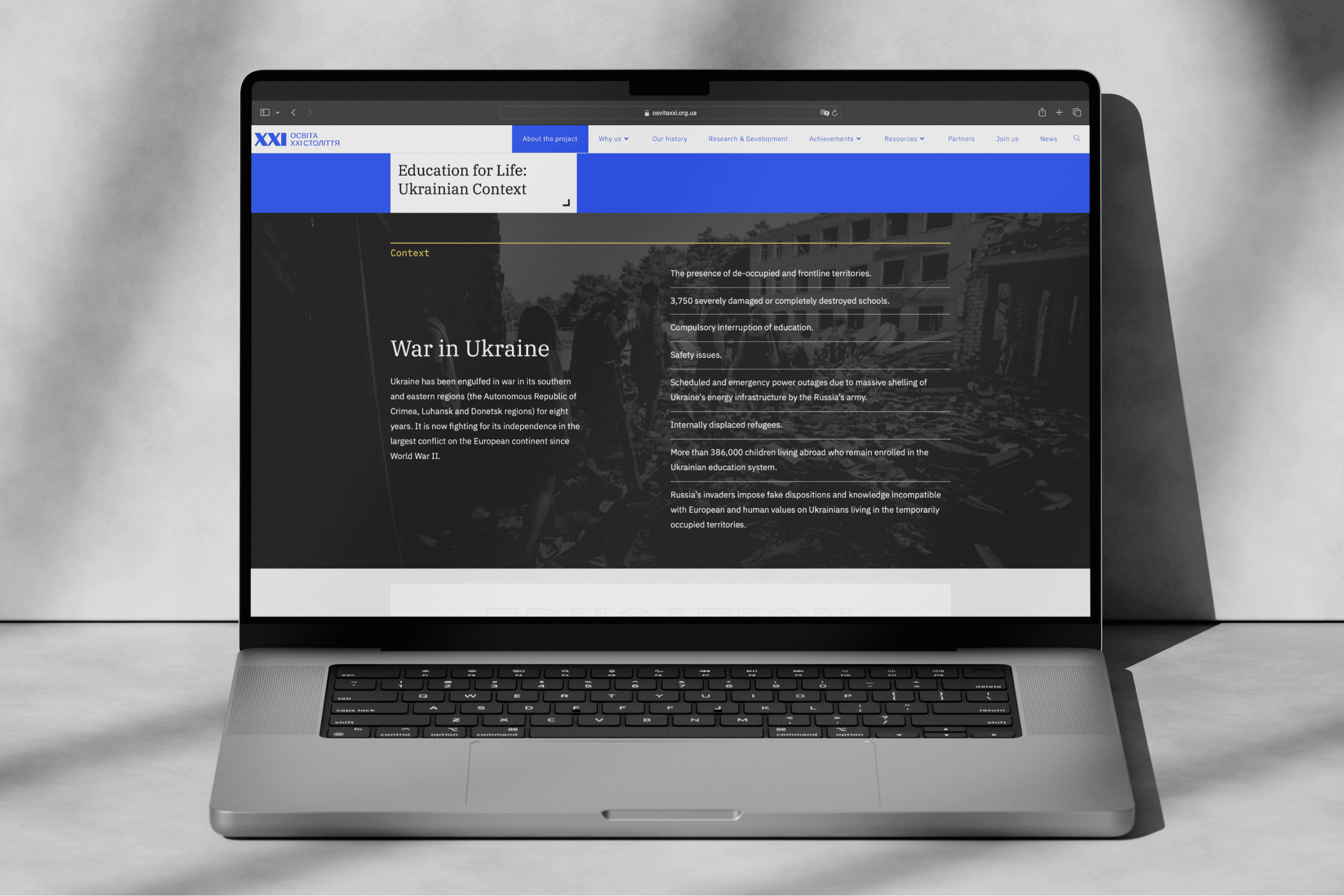
The Challenge
Complex agenda
Loads of data
Awareness
Opportunity
Goals
Convey message
Captivate
Create impact
The Development
After finalizing the information architecture, we started the sitemap creation process, which underwent meticulous optimization to align with grant requirements and content priorities. Iterations involved careful consideration of page hierarchy, ensuring logical grouping of related content. The result was a well-structured, intuitive navigation system that guides users seamlessly through the website's wealth of information.

Finalized Sitemap for osvitaxxi.org.ua
To streamline navigation and ensure a user-friendly experience, I limited the top navigation bar to two levels. Interactive graphics or page scrolling facilitate deeper exploration of content, providing a balanced approach between depth of information and ease of access. The result was a well-structured and intuitive navigation system.
Website Builder
When faced with constructing dozens of pages within a tight timeframe, a robust integrated website builder was essential. Elementor emerged as the ideal solution due to its extensive library of pre-built components, a large user community for troubleshooting, and the flexibility to integrate custom code snippets seamlessly. This combination enabled rapid page development, minimized risk, and provided ample support resources.
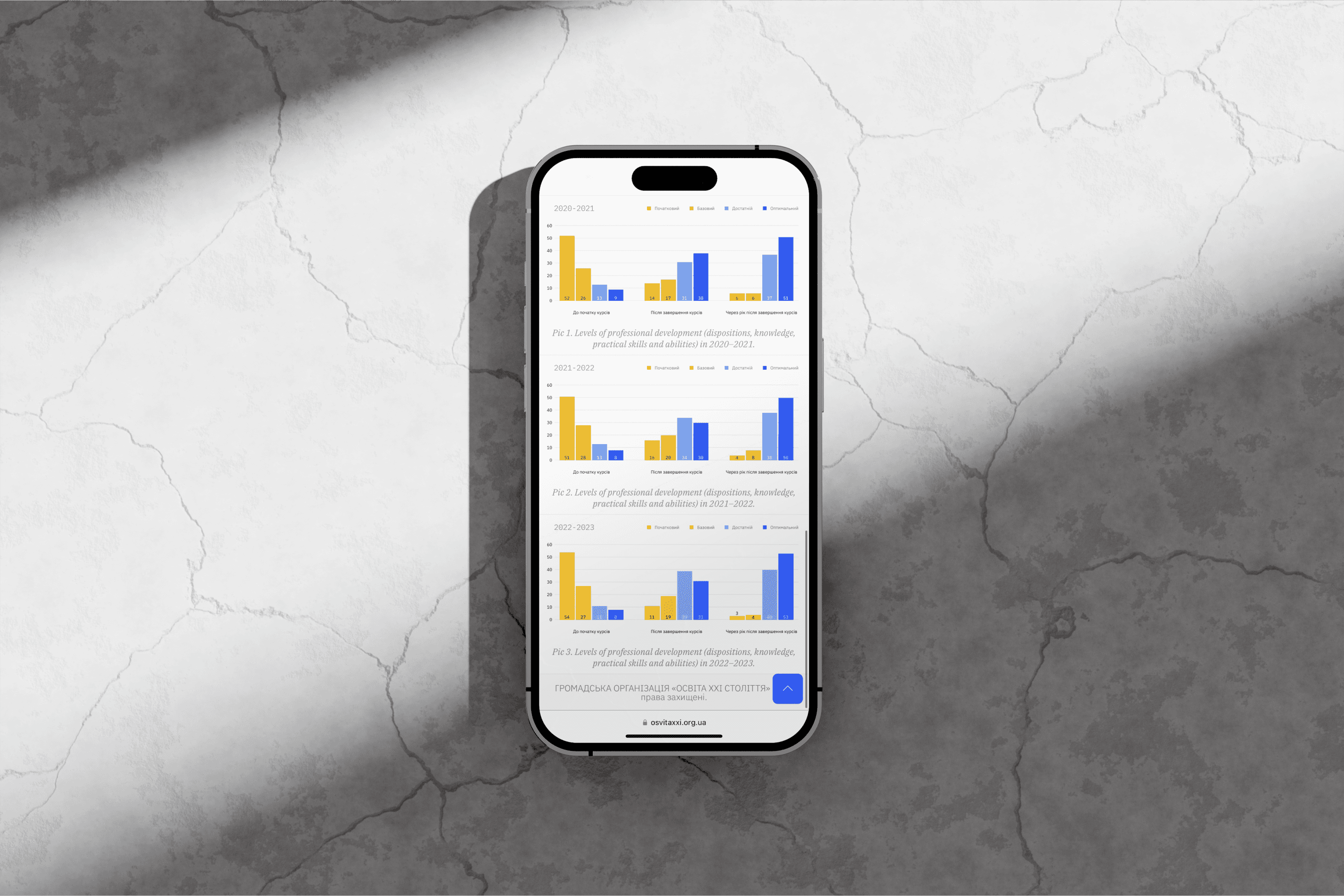
The ability to embed code blocks directly into the layout allowed me to craft several interactive vector graphics that enhanced the website's visual appeal and user engagement. Furthermore, this feature enabled the smooth integration of custom-designed diagrams and charts throughout the site, ensuring a cohesive and informative presentation of complex data.
Launch Results
Daily Unique Users
Finished Product
The website, launched in late November, is actively maintained by the organization and is poised to become an indispensable resource for teachers both within Ukraine and internationally.